
Blog Post #3 — Sidebar Layout
If you want to highlight specific Calls-to-Action (CTAs), offers, or other information in addition to your main blog content, Blog Post Layout #3 might be the charm.
In this layout, the blog content is provided in a relatively narrow column, just like in the other layouts. But instead of being centered on the page, the text is oriented left to make room for a sidebar on the right side of the page.
This sidebar can be used to highlight things like your newsletter or a Lead Magnet you want to draw attention to, or you could even list an upcoming event you want to try and drive traffic to.
And of course, you can still use things like:
Bulleted lists, which can break up text and make it easier to scan
Or…
Numbered lists, which are great when sharing step-by-step instructions or any “top #” style blog posts.
You can also use…
Headings, to clearly separate different sections of your content
So what makes Layout #2 different from #1? Well, in addition to all the text options you can create, this template also includes various Calls-to-Action (CTAs) to further engage your audience.
For example, here’s a CTA that encourages folks to sign up for your newsletter:
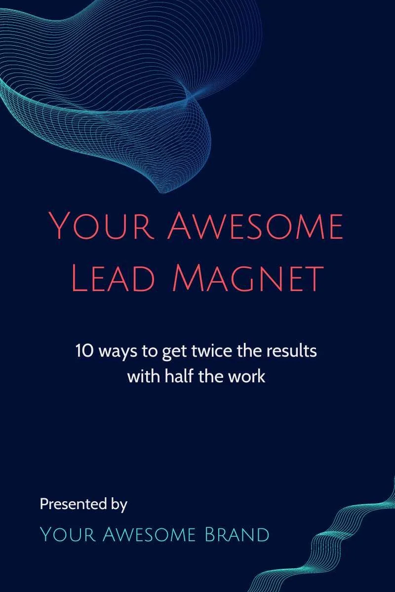
And here’s a CTA that encourages folks to download a related Lead Magnet:
These CTAs can can moved wherever you like just by clicking and dragging.
Happy blogging and stay awesome!
Want to dig deeper?
Get our Awesome Lead Magnet
With 10 actionable tips to help you get better results with less effort, this guide can be a game changer.